Sunday 31 January 2016

Business Cards

For my professional studies module I am required to create and print business cards that reflect my designs and chosen career path. As a surface designer I really want my business cards to show off my illustrations but also look really professional and memorable - so people can look at the card and remember my work and what I do instantly. To do this I think some form of illustration on the card will be of massive importance as it needs to be really eye catching and memorable. I think the font I use for my name and what I do is also really important, as it needs to stand out, I also want my chosen font to be memorable to my brand of design, so it needs to be the same on my blog, social media, website, etc.

My first attempt ...


At first I was really happy with this first draft but now I think there is way too much going on text wise and not enough illustration, instead of trying to squeeze every form of contact/social media on one side with such large font I think I should make us of the back of the card and provide the information of how to contact me and where on there. I quite like the negative space in this draft and I think it flows well but there is simply too much font and not enough illustration. Although I feel I've varied my drawings I still don't think there is enough colour in this draft. Also I don't really think its clear from this card what I actually do, so this also needs to change.

My second attempt...


I really like how clean this second attempt looks and I think it showcases my drawing abilities reasonably well. I do, however, think the repeat I've used looks far too 'blocky' and needs to flow better, I also think that just featuring only one illustration could be limiting in the design too, as I need to really showcase as many illustrations that I can do at once without it looking too crowded. The colours used in this draft are also very limiting and it isn't as exciting or vibrant as I want my business card to look, in all of my final collection there is a lot of bright colour so if someone likes the look of this business card the finished work I actually produce will be a lot different and they may be disappointed. 

My third attempt ...


I love the colours that are in this attempt, but I think the illustrations are too cropped and not fully showing off all of my drawing potential, although some of the detail in the florals has come out really clear I don't think its enough to use as a potential card for my business. The negative space in this draft looks really interesting and I think its quite successful, but the drawings are just too cropped for this design to be my final design that I get printed. 

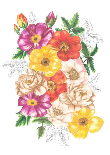
My fourth attempt ...


Again I love the colours in this design, I think they look really vibrant and exciting, which is really what I'm looking for in my business cards. I do think that perhaps this design is too crowded and that I need to space the illustrations out a bit more but I'm still undecided as I think I quite like how its looking at the moment although I seem to be changing my mind frequently. 
I really like the font I've been using in these drafts and see it as my 'signature' style, so although I'm open to changing it I feel like every font in my name should be the same if that makes sense? What do you all think?
Please feel free to leave any comments
Evie
xx
Share:

Thursday 28 January 2016

Final Major Project

Screen Printing


I have finally begun screen printing! After completing my koda trace I finally got around to putting it on to a screen and started printing on to the wallpaper I was kindly given from my sponsor.  I really like the outcome, but screen printing is so time consuming and so much hard work! I much prefer digital as its so much easier and quicker to complete, without leaving those annoying smudgy marks like screen printing can (when I do it). Overall I think this traditional way of printing can look so effective and professional - but I think it will take a lot of practice before I could consider this technique to produce some of my final collection.
Please feel free to leave any comments!
Evie
xx
Share:

Thursday 21 January 2016

Mural art

Trying something a bit different with my collaging today - instead of placing it in a repeat I've decided to style it as a mural like the market research I've been looking at.


I think this scale might be a little bit too big, what do you think?

Evie
xx
Share:

Tuesday 19 January 2016

New York


A quick post with some images from New York last christmas!

All photographs are my own.


Please feel free to leave any comments!

Evie 
xx

Share:

Drawing with Photoshop

Here I have used Photoshop to create another drawing, this has been drawn on top of one of my original coloured pencil drawings that have been scanned in, then removed after I had finished tracing it with the Photoshop pencil tool, I'm loving this technique and the texture it creates, this is something I will use further along my project to create backgrounds with and to work on top of as I'm not sure its strong enough to be a placement print, what do you think?


© Evie Ward 2016

Please feel free to leave any comments!

Evie
xx
Share:

Wednesday 13 January 2016

Market Placement

Using Photoshop I have placed some of my designs in repeat onto a interior background I think is suitable to see how my designs would look printed into a repeat as a wallpaper. Two separate collections of wallpaper and fabric lengths will be my final hand in for my Final Major Project at university so I definitely need to experiment with several designs before selecting the final ones to be printed.


Please feel free to leave any comments
x
Share:

Sunday 3 January 2016

Collaging my drawings...


© Evie Ward 2016

Please feel free to leave any comments
x
Share:

Saturday 2 January 2016

Combining old with new ...

Here I have collaged my original colour pencil drawings with Photoshop pencil drawings...

© Evie Ward 2016

Please feel free to leave any comments
x
Share:

Photoshop Drawing


© Evie Ward 2016

Another drawing created with the Photoshop pencil.
Please feel free to leave any comments
x
Share:

Friday 1 January 2016

Blog takeover - freelance designer Robyntoria

Robyn is an illustrator from the North of England and graduated from Cleveland College of Art and Design, which she earned a scholarship for in 2009.


Interviewing Robyn ...

What have you been up to since graduating from university in 2013?

Since graduating from Cleveland College of Art and Design in 2013 I have been working as a fashion and portrait illustrator. I have always known this was my dream job, so in my final year at university I began applying to various illustration agencies. I was lucky enough to be accepted by Inky Illustration agency a couple of months after graduating. Since then I have worked on various projects, most recently the "Whats your line?" campaign for Clinique which was featured in Grazia magazine and on Grazia daily. 


Robyn's illustration in Grazia magazine.

What has been your favourite illustration to complete so far?

My favourite illustration is probably the one I drew of Gigi Hadid wearing a peony flower crown. I'm obsessed with peony roses, and she's so beautiful. 


Robyn's illustration of Gigi Hadid.

What are your plans for the future illustration wise?

This year I'm going to put a lot more effort into promoting my illustrations via Facebook, Instagram and my website, its something that I'm just not very good at and need to work on. I also want to spend a lot more time illustrating, maybe setting a goal of creating at least two illustrations a month. 


Illustrating for magazines -


Robyn work is available to buy as prints, happy birthday cards or notebooks on Easy - 

https://www.etsy.com/uk/shop/RobynToria


Contact Robyntoria - robyn_victoria@hotmail.co.uk
Her regularly updated blog - 
purplepeoniesandcandyclouds.blogspot.com

Share:
Blog Design Created by pipdig